The goal was to give greater meaning to both its visual and verbal tools in order to enhance its communication.
Aruma is the leading chain in beauty and personal care products in Peru, with more than 90 stores nationwide.
The goal was to give greater meaning to both its visual and verbal tools in order to enhance its communication.
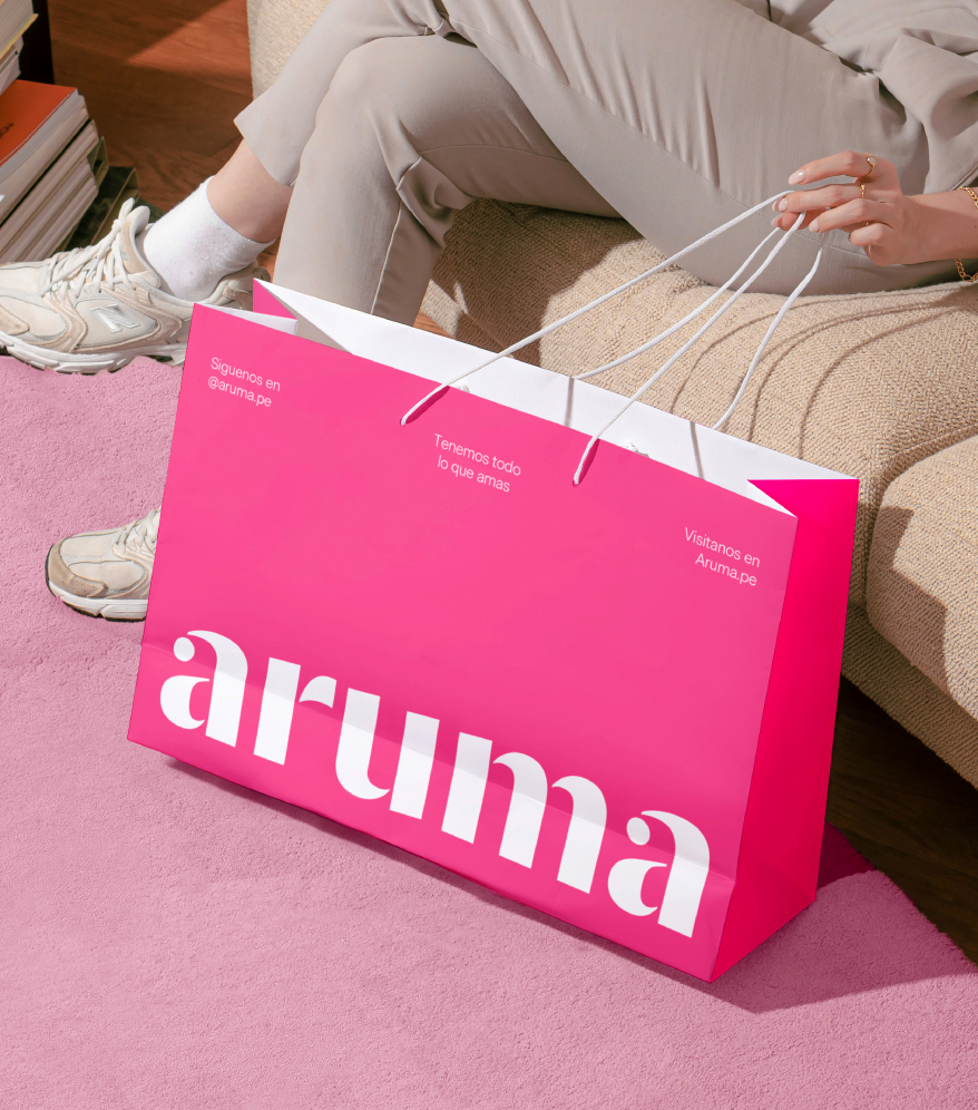
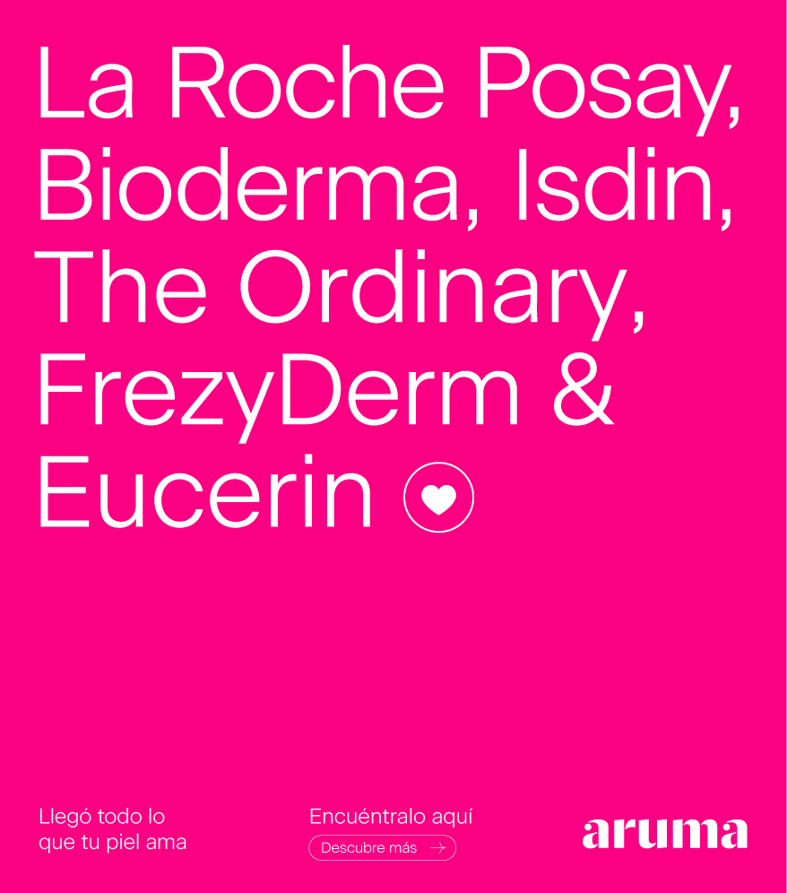
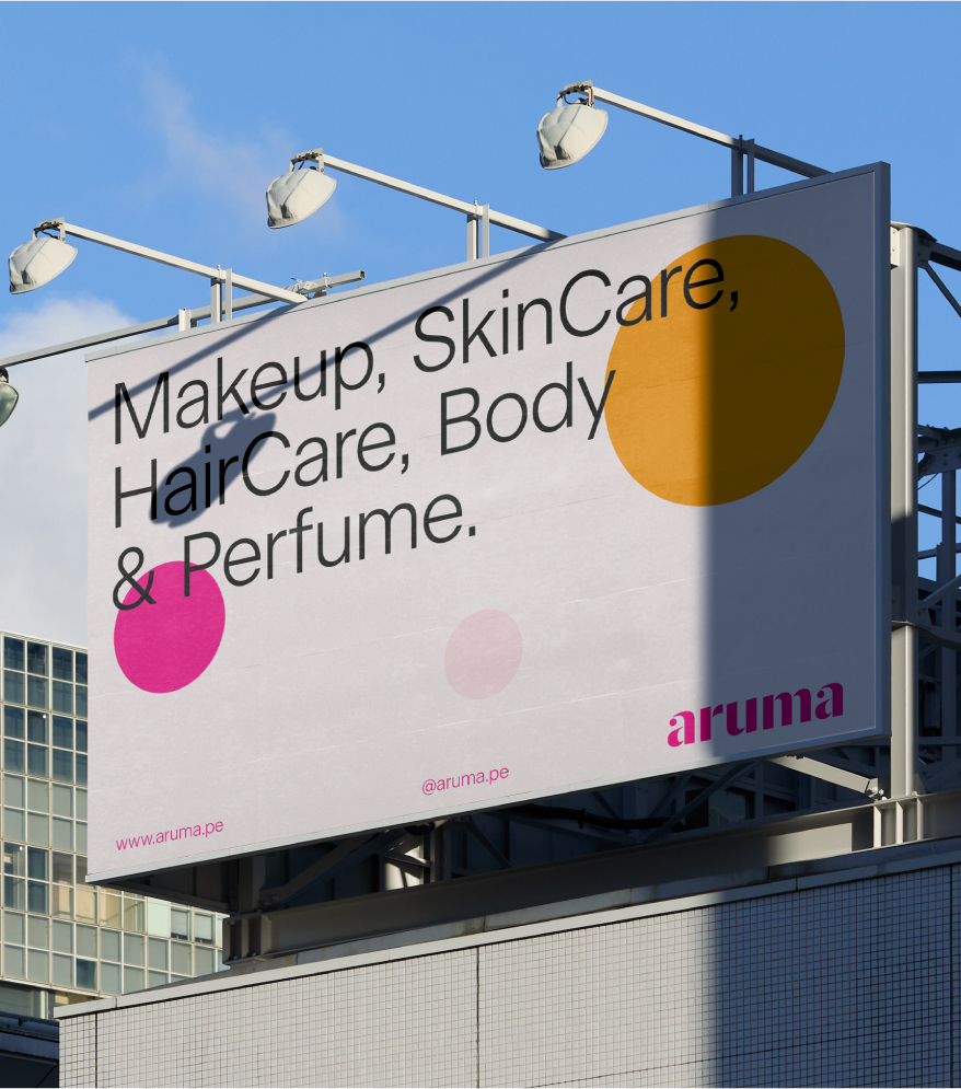
We undertook the task of reorganizing and restructuring each graphic element, developing a visual identity system that leveraged the “dots” in the logo along with new assets. We intensified its iconic magenta to a more vibrant shade and created a more expressive secondary color palette, inspired by the beauty world.
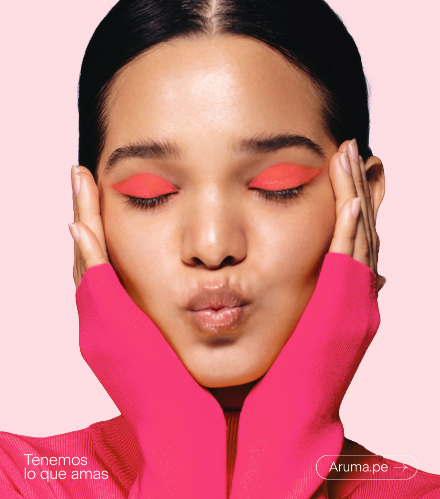
We designed a new flexible typographic set that adapts to different types of messages.
