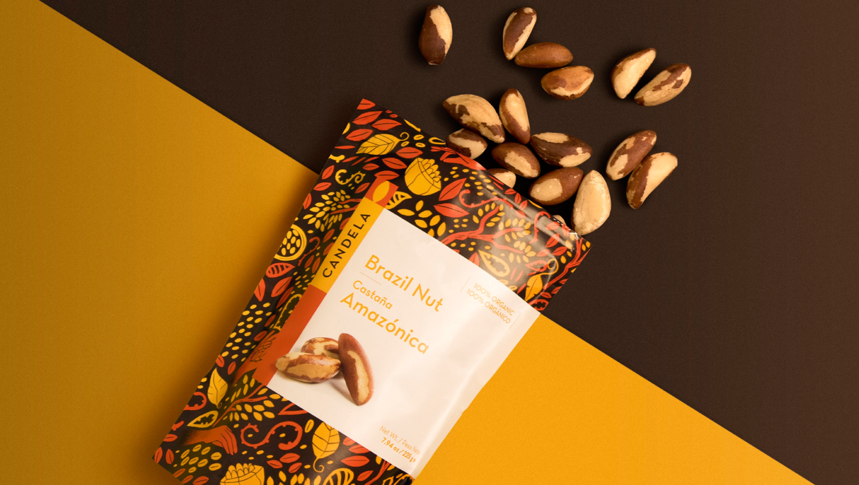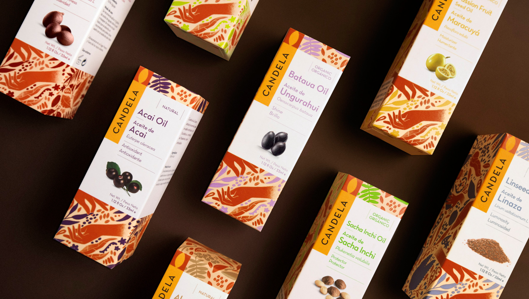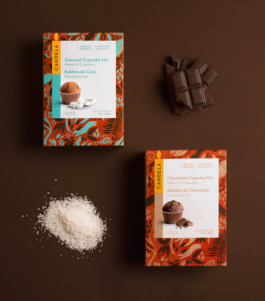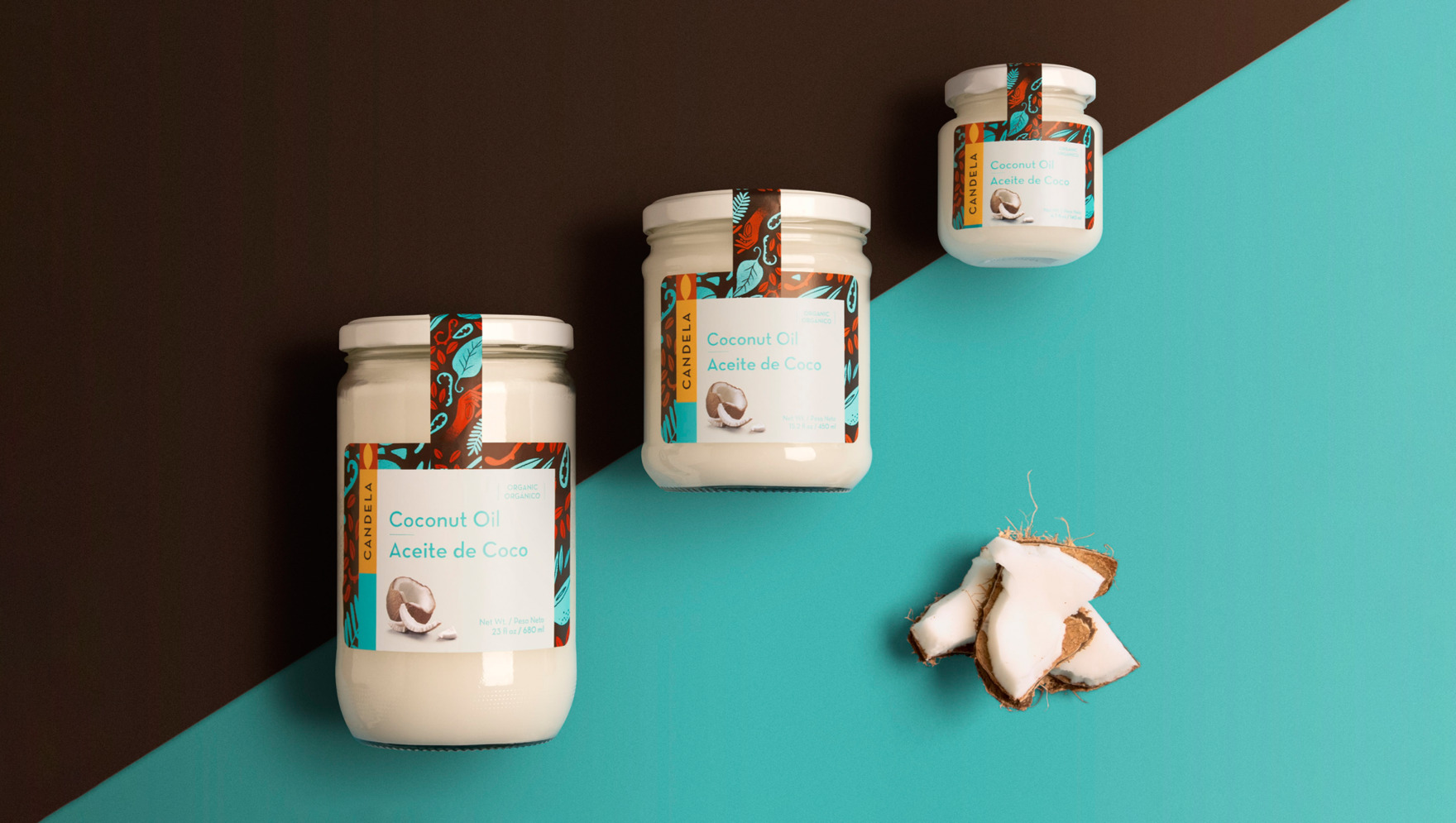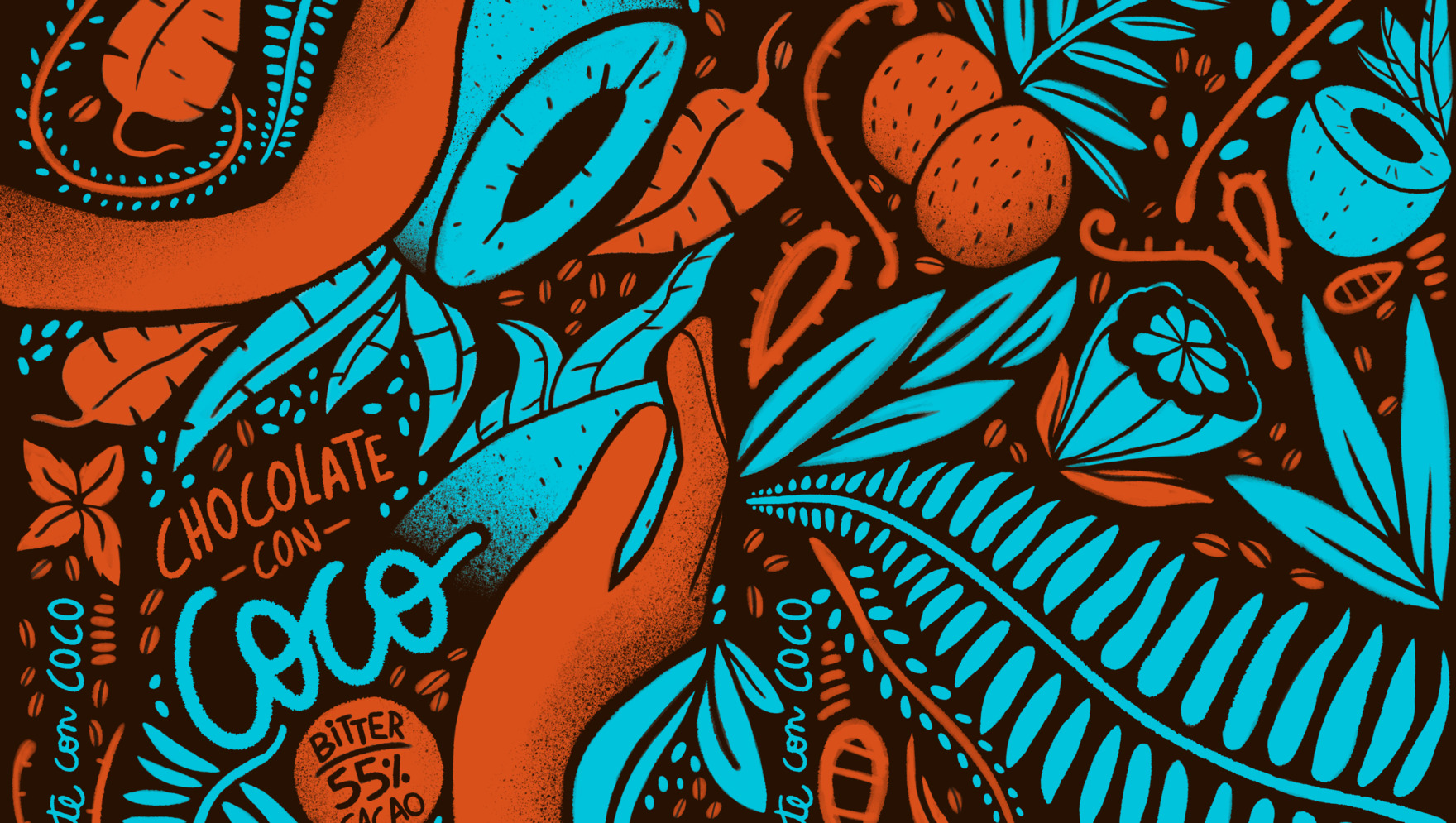
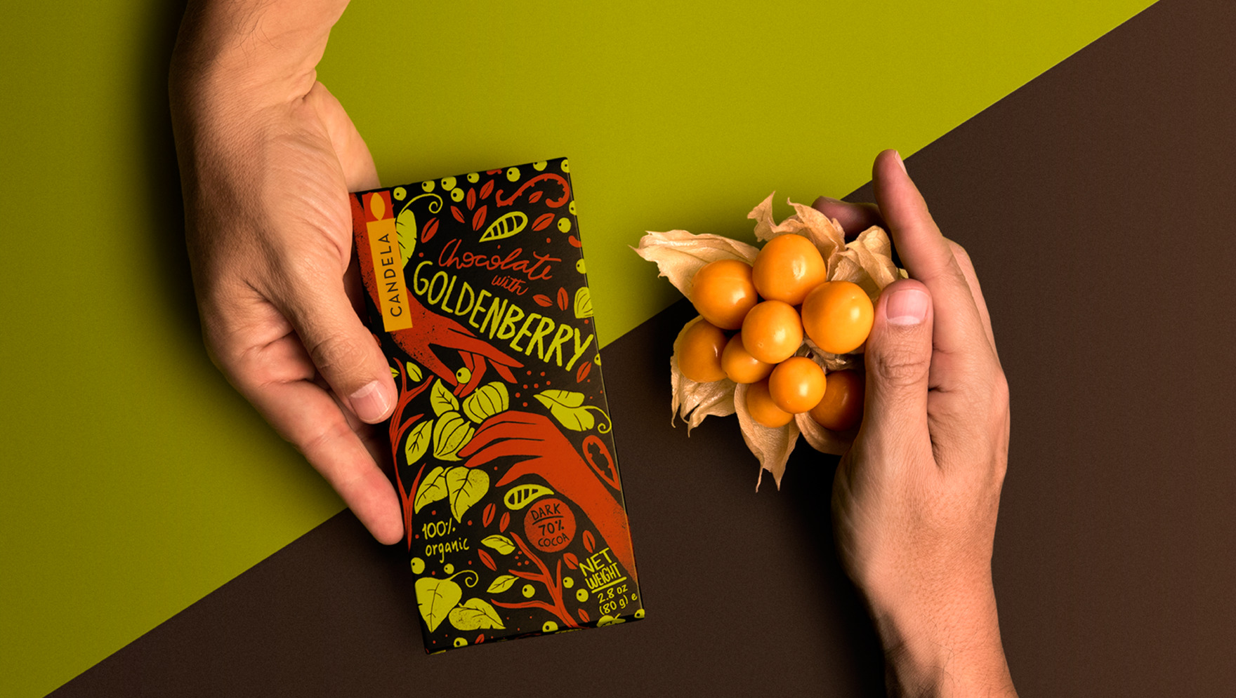
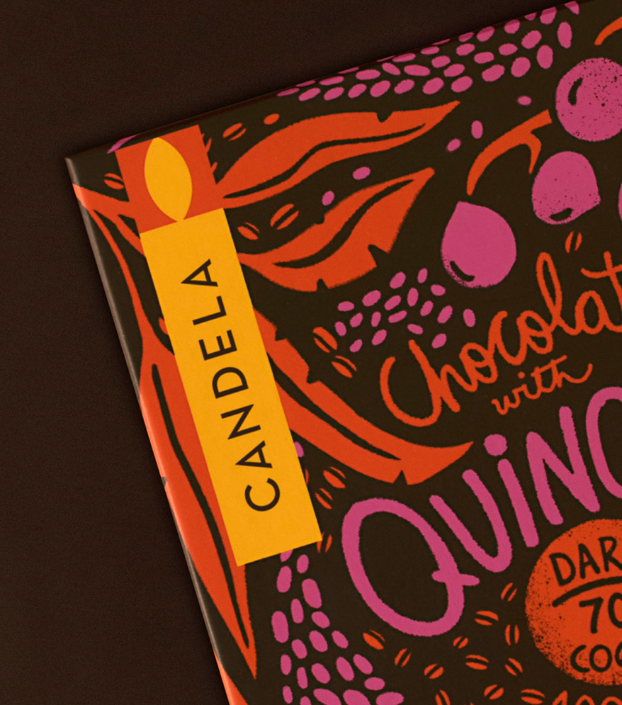
We proposed a logo based on a simple and geometric “candle”, directly alluding to its name and creating a strong contrast with an illustration system featuring the hands of the producers of their products.
These portray the richness of nature itself, evidencing Candela’s care for the environment and all the actors involved in the process.
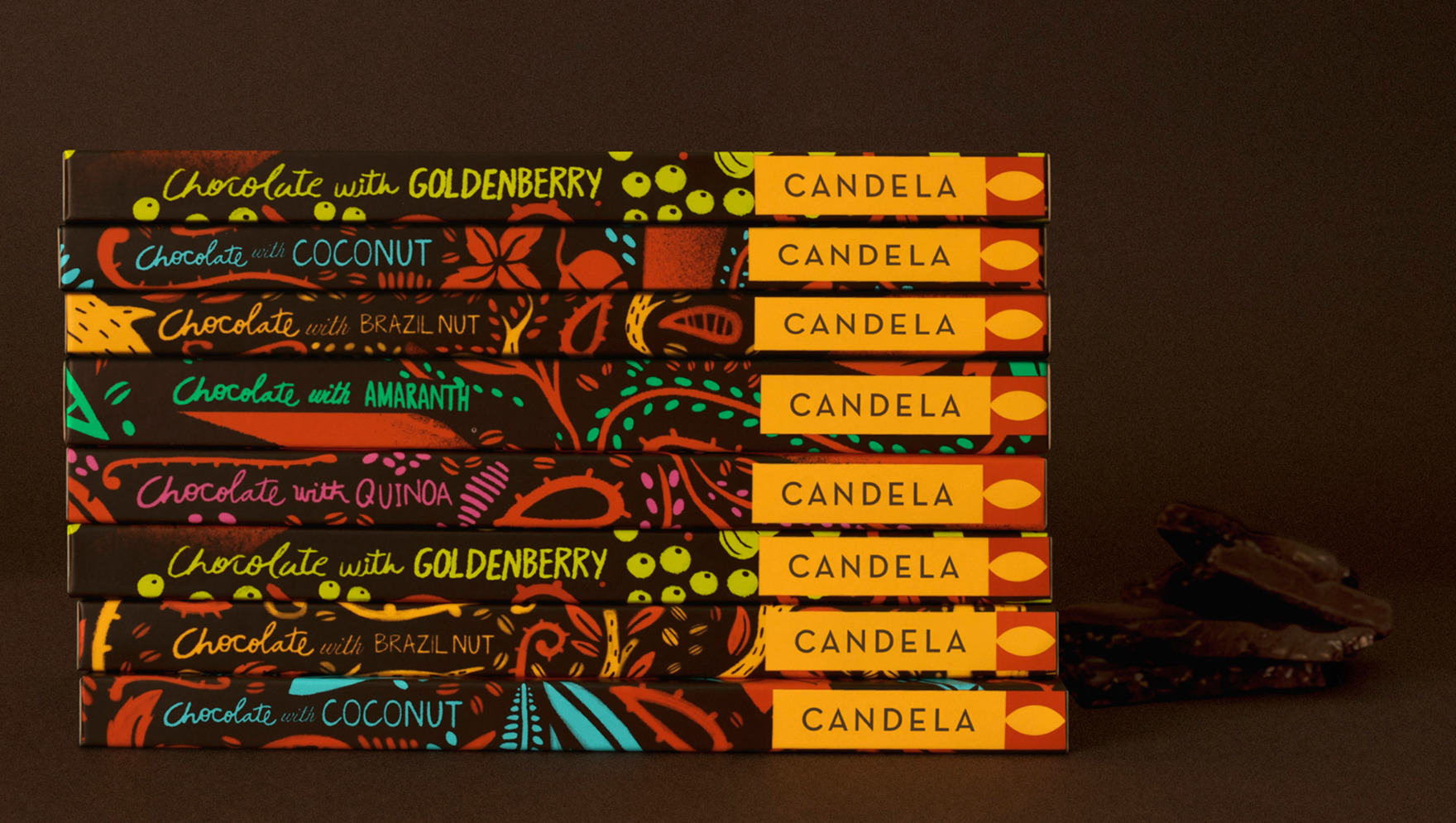
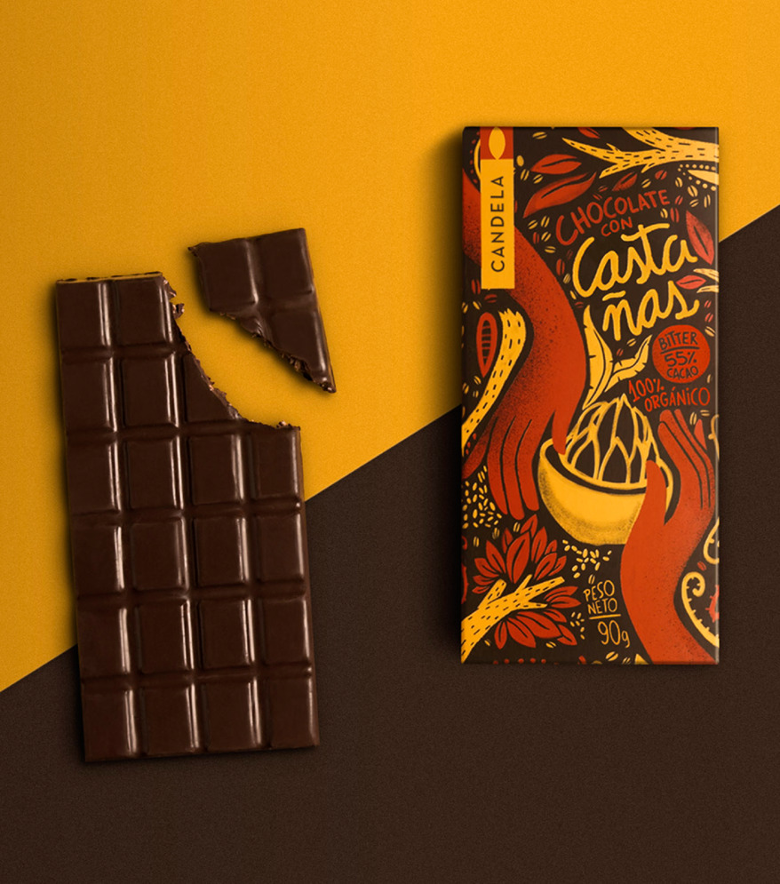
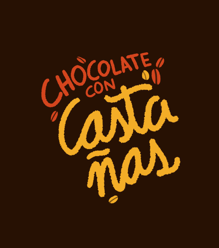
For the premium chocolate line, customized illustrations were created for each variety. For the other business lines, a graphic system was established based on the logo and describing the different products.
