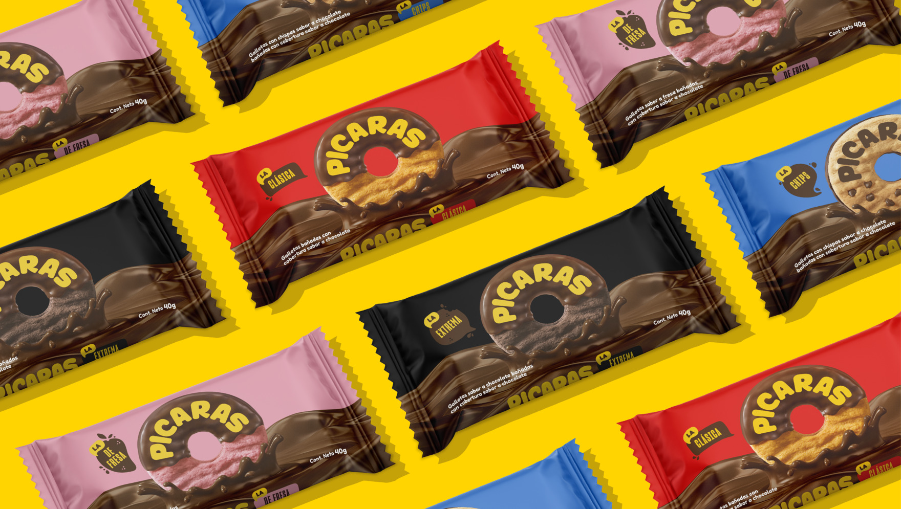
To cater to new generations, we have refreshed its strategic platform, visual identity, and all packaging across its product line.
We refreshed the identity of a beloved Peruvian brand
With 40 years in the market, Pícaras has become one of the most beloved brands in Peru, being remembered by young and old people for to its iconic ring shape and chocolate coating.
To cater to new generations, we have refreshed its strategic platform, visual identity, and all packaging across its product line.
“More, no matter how you look at it” was the brand concept that reflected the identified values of being authentic, nonconformist, smart, and cool. We materialized this concept by incorporating a friendly and playful language, showcasing the prominence of chocolate, and emphasizing the iconicity of its shape.
We decided to integrate the logo into the cookie to create a distinctive symbol that would allow us to capitalize on one of its most recognizable elements and also differentiate ourselves from the competition.
The main colors were prioritized and modernized and the portfolio system was complemented with a secondary palette that allowed for the simple yet distinctive classification of its various flavors, easily recognizable on the shelf.
In selecting the primary typography, we matched it with the cookie’s shape, while employing a secondary, more structured typography to enhance modernity and contrast within the system.
