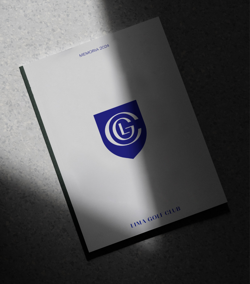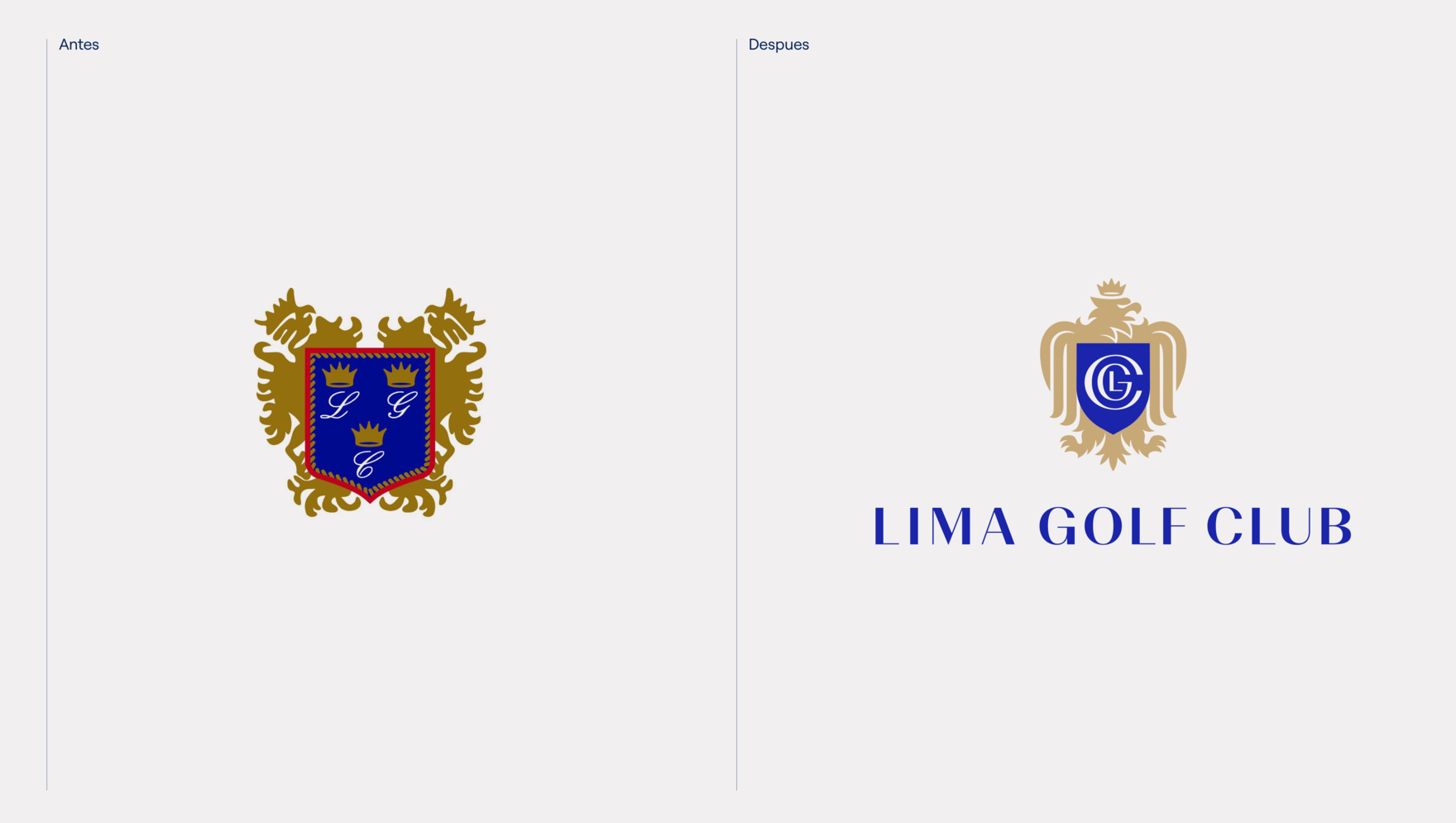
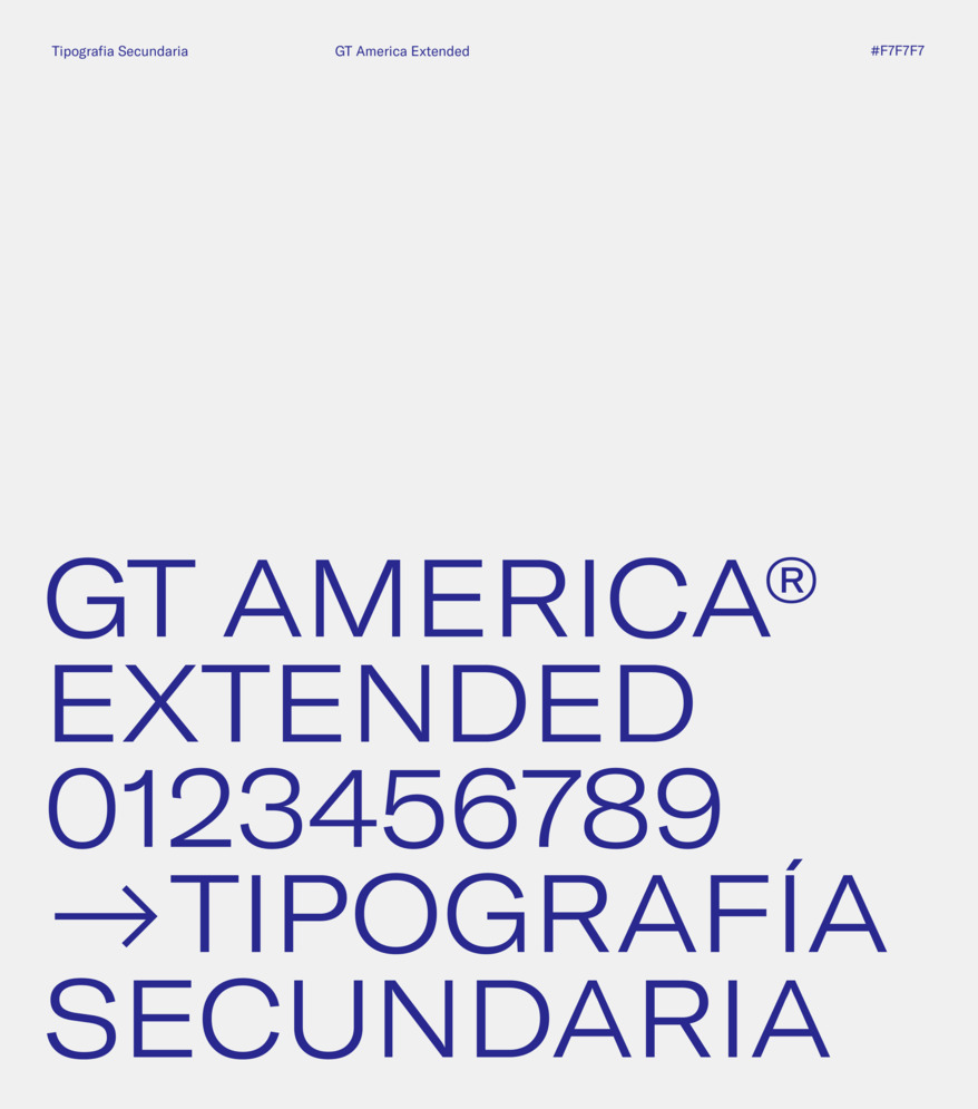
Our primary goal was to modernize the brand, making it easier for the club’s younger community to integrate while still catering to its older members. Initially, we streamlined the logo, preserving its core essence and key attributes. We adjusted the brand’s primary colors and complemented them with a secondary palette of accent colors to achieve a harmonious balance and a contemporary feel. Moreover, we introduced an elegant typography that embodies professionalism and prestige.
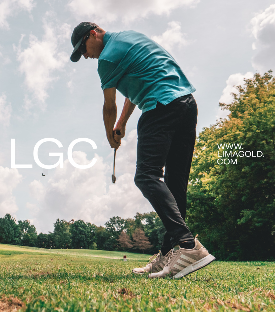
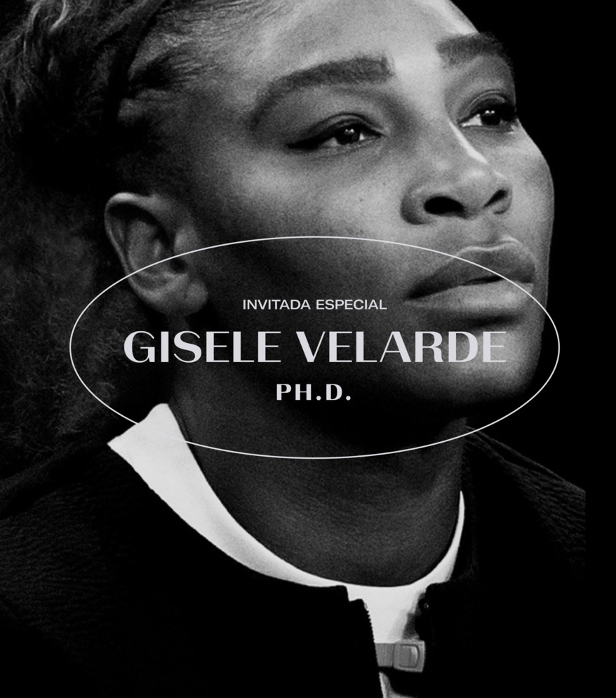
For the system, we took inspiration from the idea of community while also evoking the holes on golf courses. This shape provided us with great flexibility in its application, allowing us to highlight photographs, phrases, and textures, giving the brand more personality and ownership.
