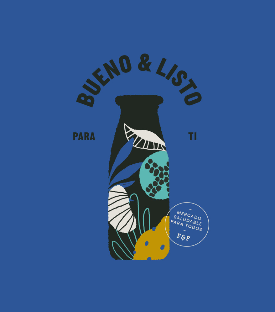
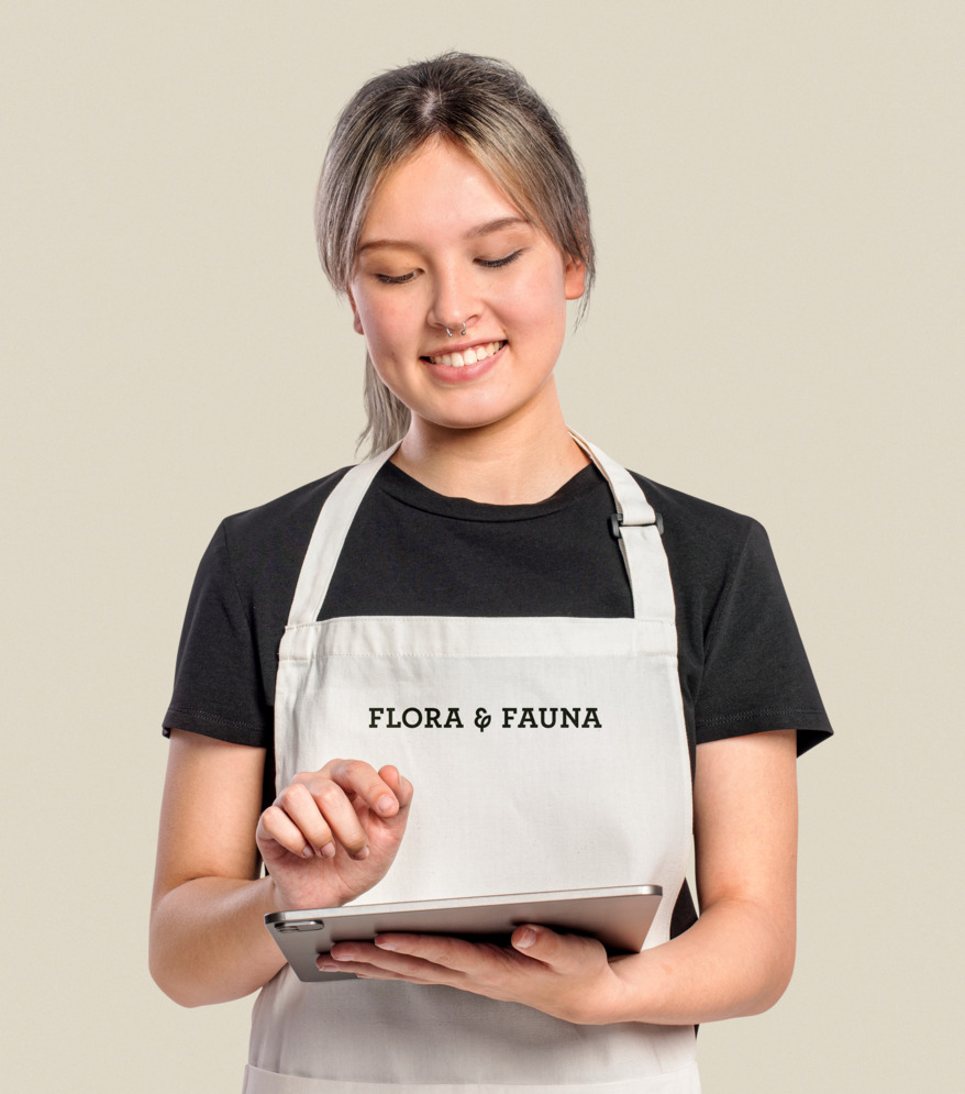
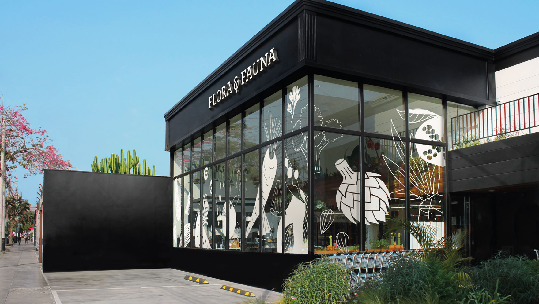
The identity is composed of an illustration system based on silhouettes that contain stories. These narratives unfold the journey behind each product before it reaches our hands and how they connect us with nature, agriculture, and well-being. The photography reflects the brand’s spontaneous and natural attitude. It also highlights the dedicated and meticulous work behind each product, driven by a passion for nature and providing a product for well-being.
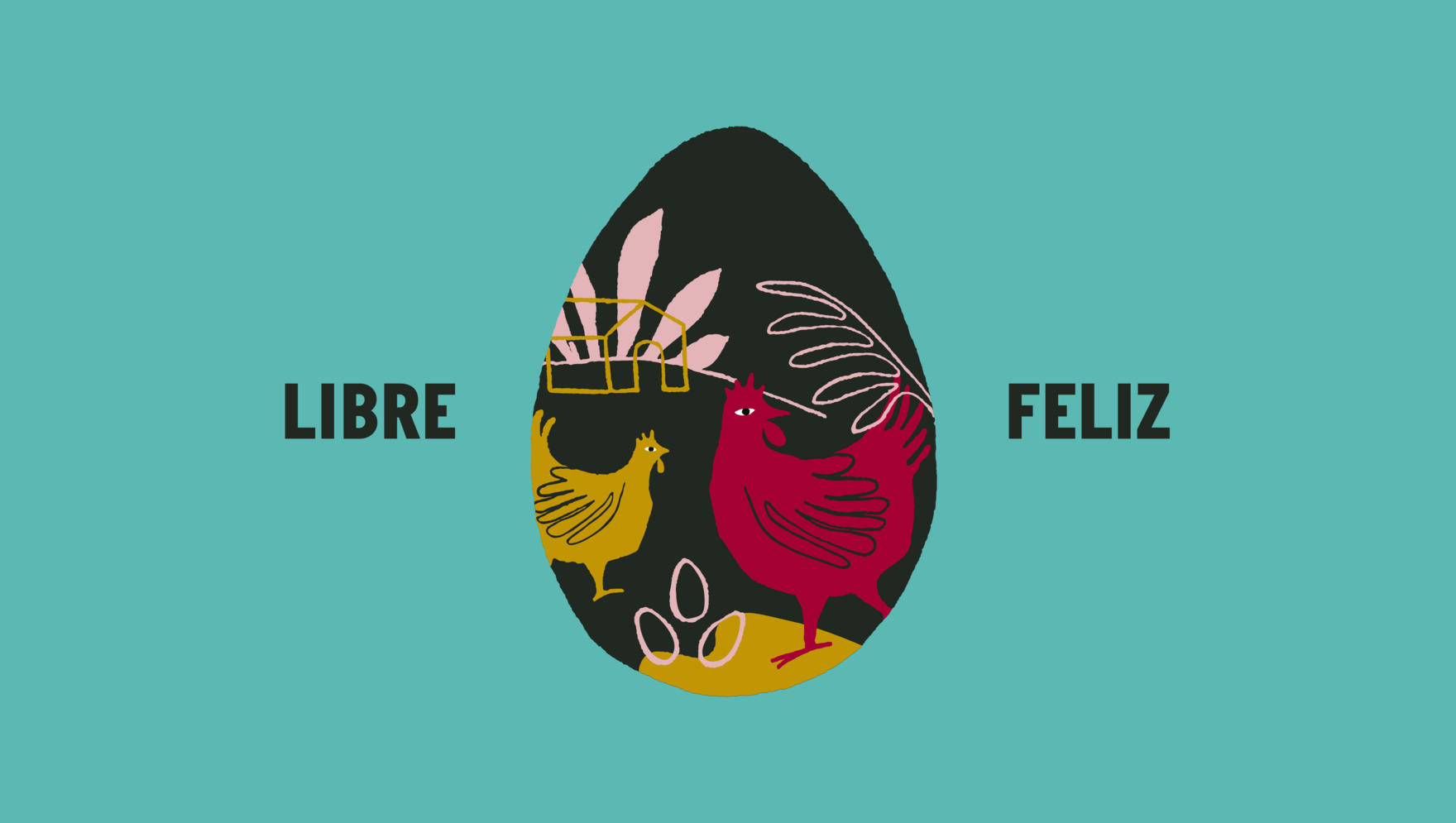
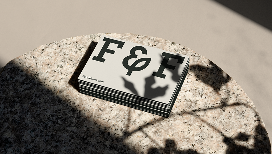
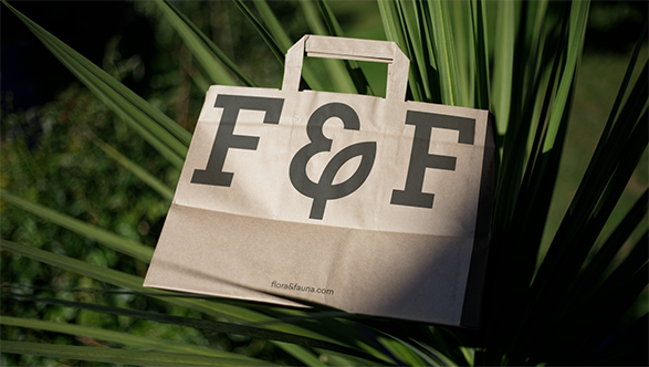
The Flora & Fauna’s seal contributes to solidifying the brand’s identity and immediately links it to the concept of a healthy market. The layout style is designed to enhance warmth and flexibility in communication.
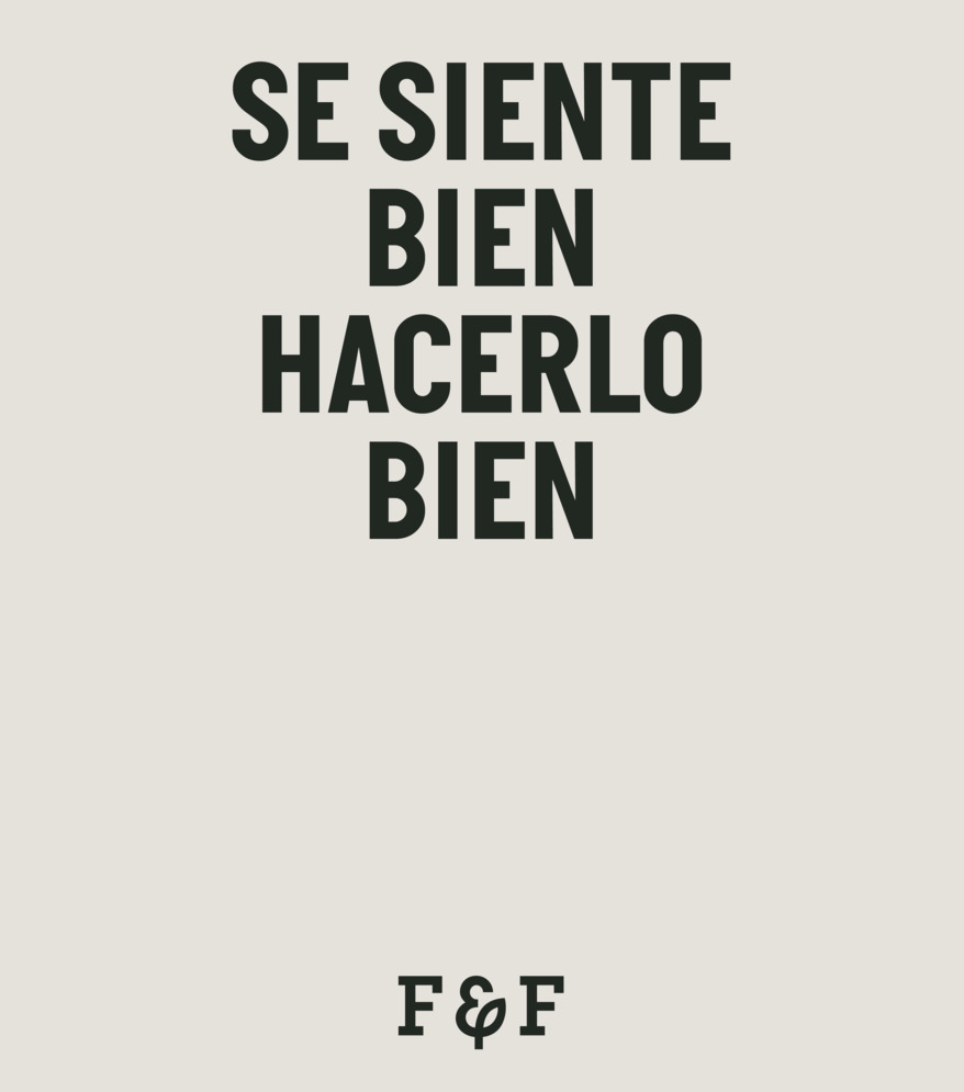
The sans-serif typography arranged horizontally, complemented by smaller secondary information in an arched form, aims to provide warmth and visual impact to the message.
