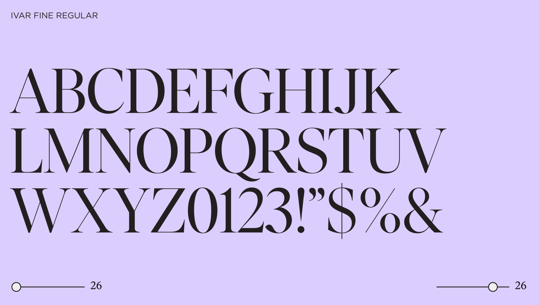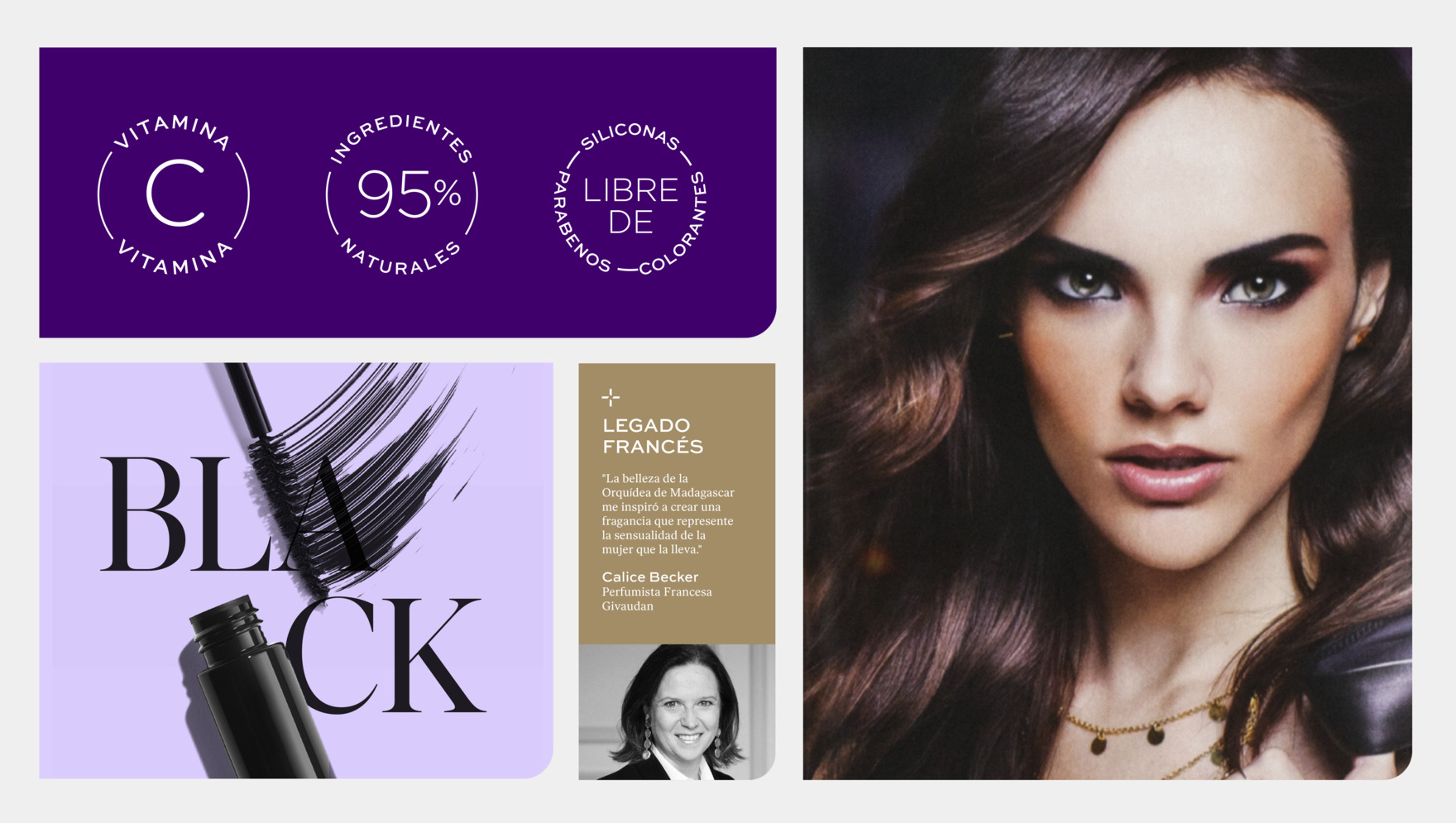
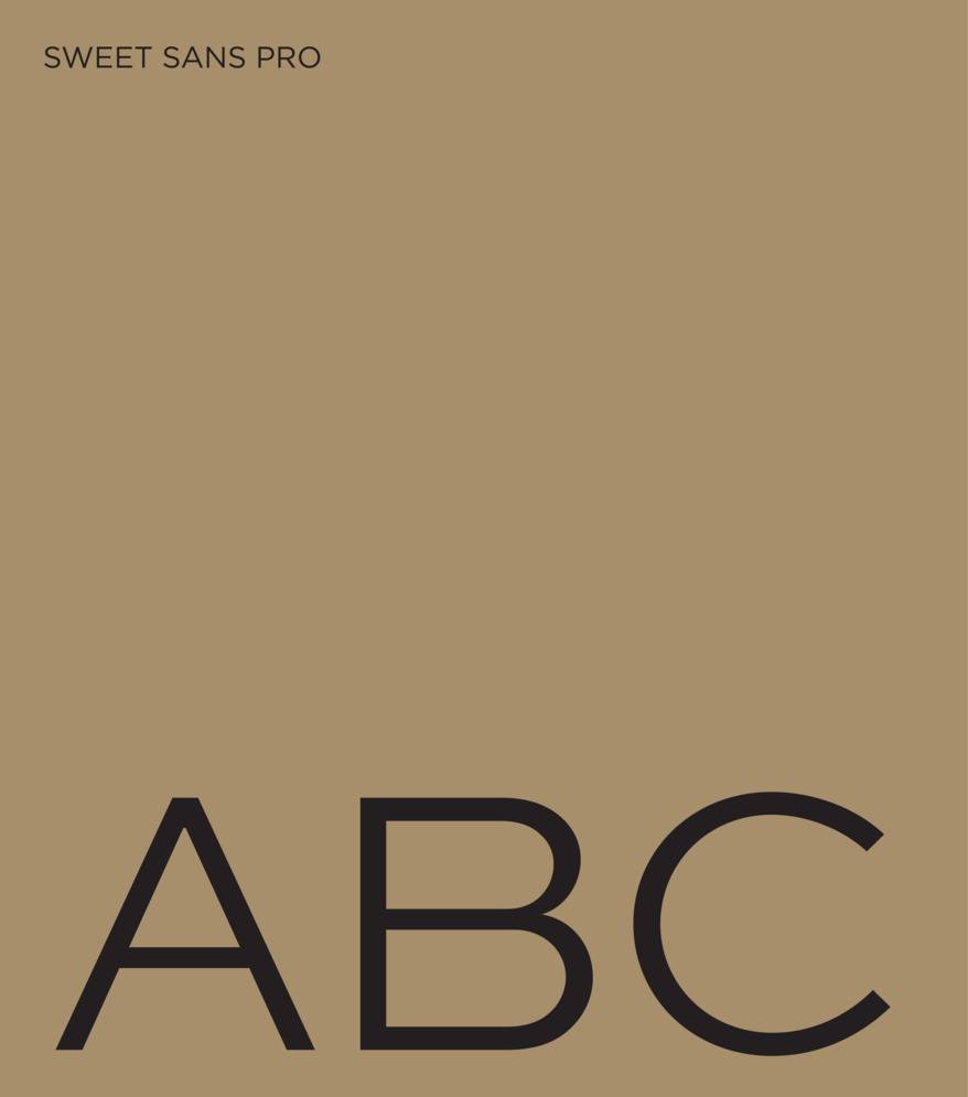
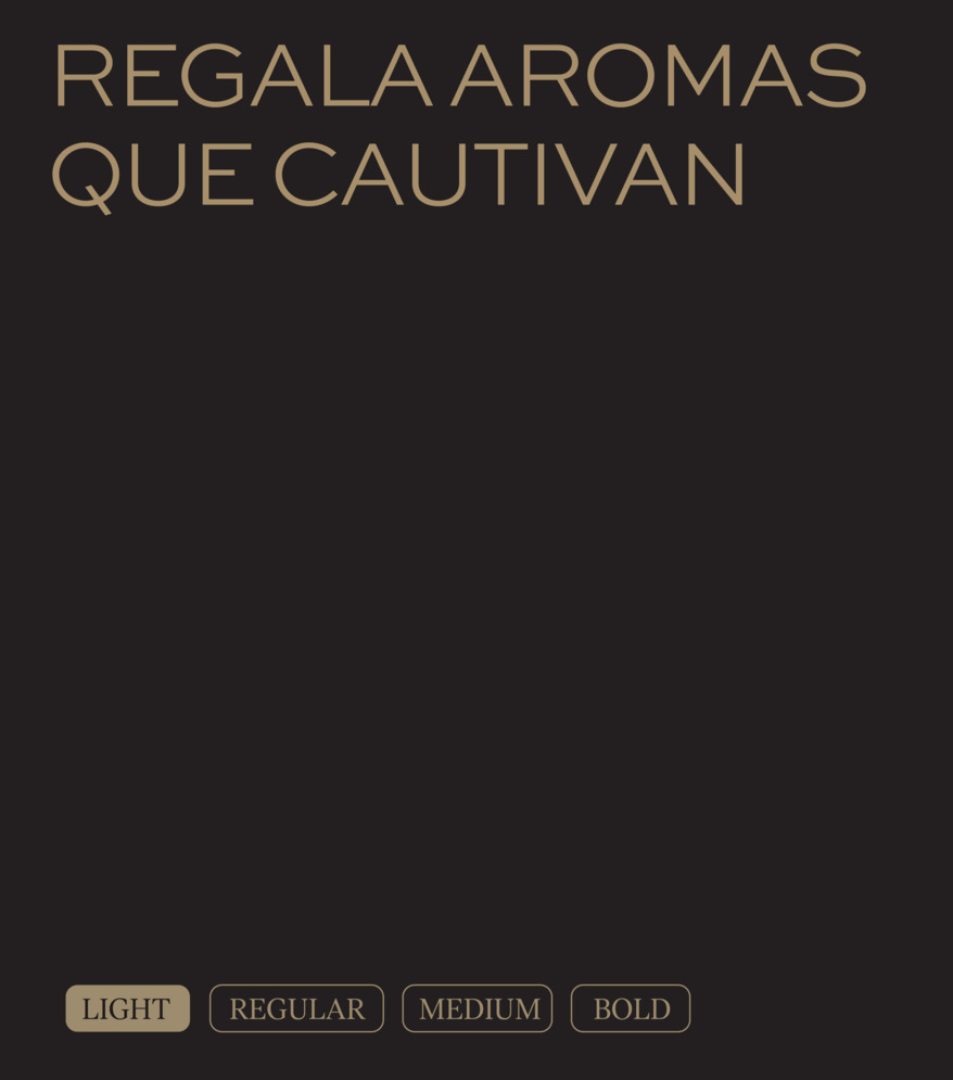
As an initial step in the process, we created the Build-up phase where we proposed: the evolution of the primary and secondary color palettes and their respective roles within the system; the selection of a typography with greater impact and modernity to enhance brand legibility; and a new format for discount seals.
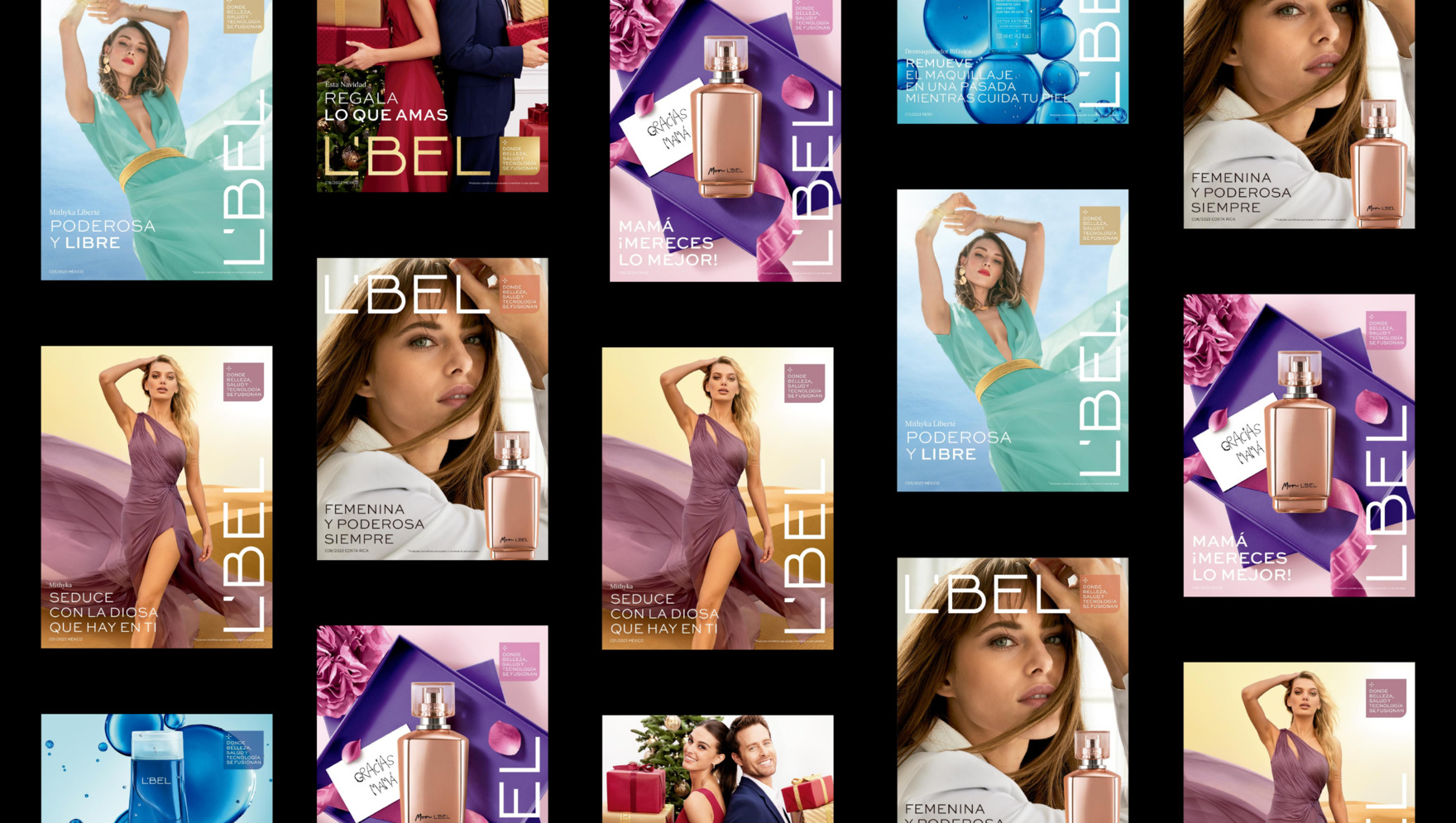

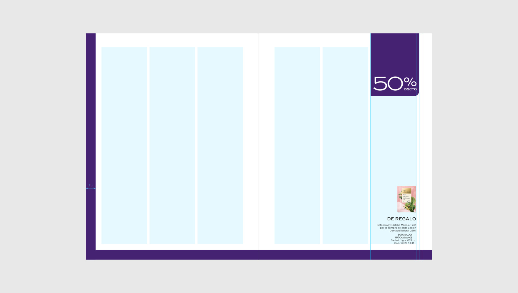

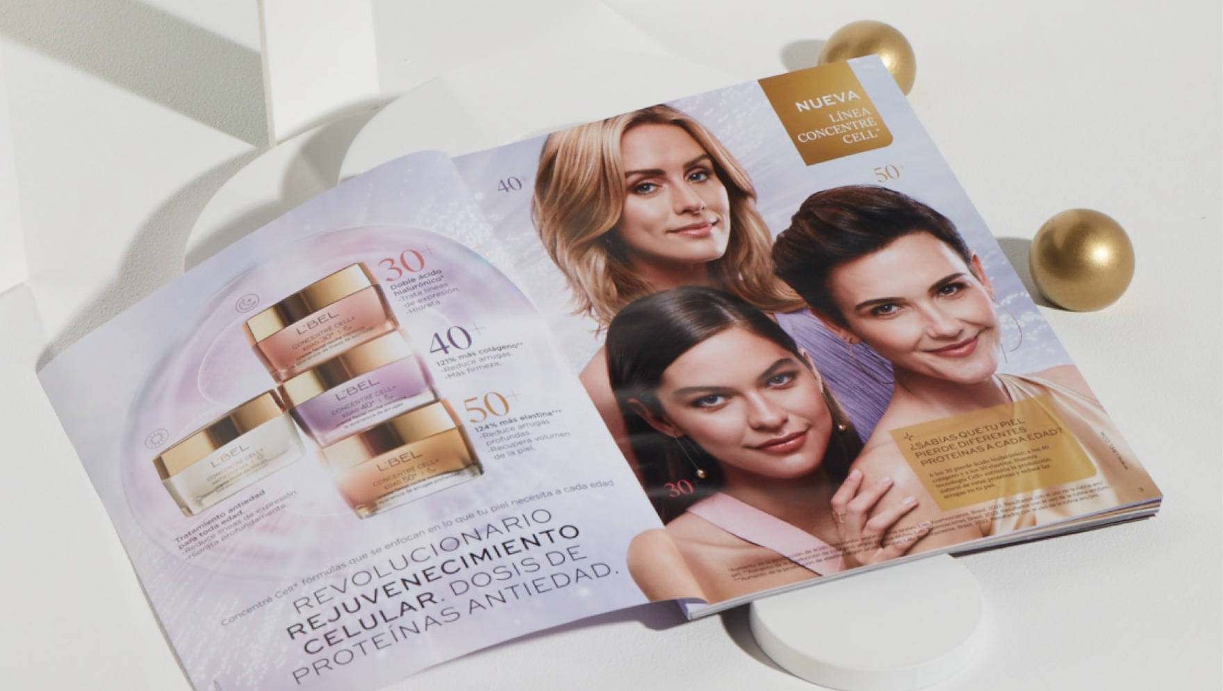
Using this new system designed to structure and prioritize the key elements of the brand’s communication, we developed the layout for both the catalog and social media assets. Our aim was to transmit the brand’s modernity and the allure of its products through a photographic style consistent with its updated positioning.
